A component library you can retheme without forking.
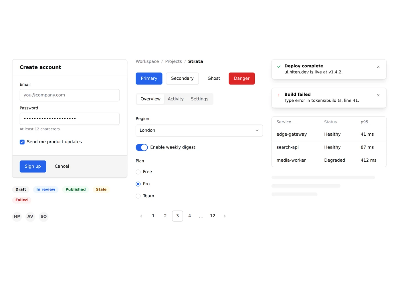
Strata is a set of 20 framework-agnostic web components (Lit 3 and TypeScript) with a
deliberately neutral, shadcn-style baseline. The engineering story is the theming surface: every colour,
radius, shadow and motion decision routes through two tiers of design tokens, and every internal element
is addressable through ::part(). To prove the surface is complete, the repo ships an entire
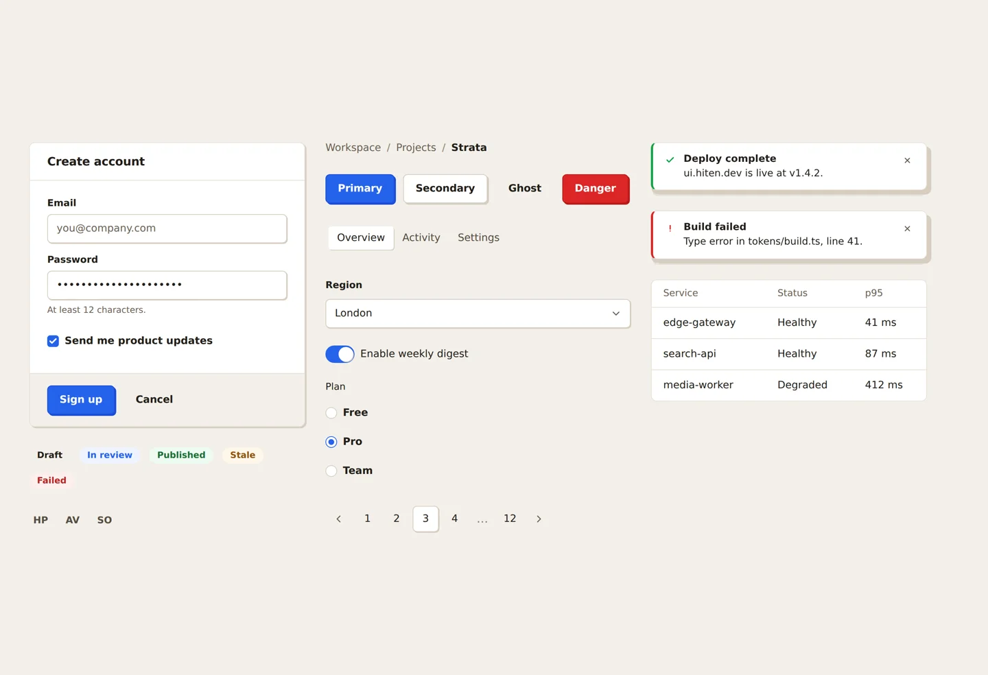
alternative visual identity as a single CSS file that never touches component code.
Browse the live Storybook; the toolbar switches theme, accent
and skin on every story.
The shape of the thing
Twenty components: buttons, the full form set, overlays (dialog, menu, toast, tooltip), and data
display (table, pagination, breadcrumb, skeleton, avatar, badge, tabs), each a Lit 3 custom
element rendering into Shadow DOM. Because they’re standard custom elements they work in React, Vue
or plain HTML; the Storybook carries a framework guide for each. The docs are part of the deliverable:
a token reference, the full ::part() inventory, an accessibility statement, and a guide to
writing your own skin, all published at ui.hiten.dev.
- TypeScript
- Lit 3
- Shadow DOM + ::part()
- Design tokens (W3C-style JSON)
- CSS custom properties
- Storybook 8
- @web/test-runner
- axe-core
- Playwright
- GitHub Actions
- pnpm
Two tiers of tokens
The token architecture has a hard rule: components never read primitives. A build script compiles a
W3C-style tokens.json into CSS custom properties in two tiers: primitive scales
(greys, radii, type sizes) and the semantic --strata-* layer components actually consume:
--strata-surface, --strata-border-strong, --strata-focus-ring,
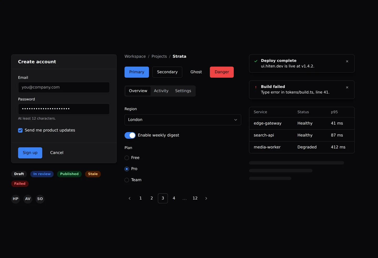
--strata-shadow-md. Dark mode and the accent variant are nothing but semantic remaps behind
data-theme and data-variant attributes: no rebuild, no JavaScript, and
they compose: dark + skin + accent all stack on one <html> element.
Where tokens run out (per-variant treatments, hover transforms, decorative edges), the
second layer takes over: every meaningful element inside every shadow root is exported as a named
part, and the full inventory is documented. Between the two layers, an implementor can
restyle anything worth restyling without ever forking a component.
The skin proof: Strata’s first visual identity was Sediment: warm,
slab-like, solid offset shadows, press interactions that drop a button onto its shadow. I shipped it,
then threw it out: a component library with a loud identity forces a fork on anyone who disagrees with
it. The rebuild made restraint the feature, and Sediment came back as the test fixture. The
entire identity now lives in one stylesheet of token overrides and ::part() rules, scoped
to data-strata-skin="sediment", switchable from the Storybook toolbar. If a bold identity
can be rebuilt without touching component code, the theming surface is complete. That round trip
(bespoke, neutral, bespoke-as-skin) was the most useful design decision in the project.
Accessibility as engineering, not paint
Every component’s test file ends the same way: mount it, exercise it, then hand the live DOM to
axe-core running in real Chromium. The keyboard contracts are hand-built and tested: the menu has
roving focus with arrow-key wrap, Home/End, open-on-ArrowDown, and focus return to the trigger on
Escape; the dialog traps focus; the tabs roam with arrow keys. The skin contract is explicit about what
an implementor may not do: recolour the focus ring, never remove it; added motion goes behind
prefers-reduced-motion.
One test is worth singling out. The menu’s axe check started failing only in CI: axe was auditing
mid–open-animation and measured the danger item’s text at 4.19:1 contrast; the colour
of #dc2626 caught at 88% opacity, part-way through its fade. The fix wasn’t loosening
the assertion; the test now awaits getAnimations() before auditing, so it checks settled
reality. That’s the level the suite is meant to work at: catching real measurement, not
decorating the CI badge.
Proof over promises
The repository is public at github.com/hitenpatel/strata: 151 tests across all 20 components running in headless Chromium via @web/test-runner, axe checks included, CI on GitHub Actions. The live Storybook at ui.hiten.dev is the same repo deployed: flip the Theme, Accent and Skin toolbars on any story and watch the token architecture do the work.